The Yearbook of Type presents a selection of new typefaces created all over the world—from larger publishers to smaller, independent typographers and foundries.


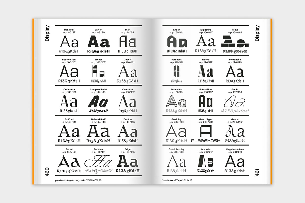


The comprehensive compendium presents a well curated overview that gives an impression of the typeface and its appearance on paper. The emotional and well constructed informative presentation of the typefaces will serve designers and agencies as a source of inspiration and help select the right typeface. As a catalog and reference work it will also be of interest to all those who are interested in the contemporary world of typesetting and the latest in typeface design.
Publisher: Slanted Publishers
Creative Direction: Lars Harmsen
Art Direction & Managing Editor: Juliane Nöst
Graphic Design Assistance: Saehyeen Shin, Clara Weinreich
Proofreading and Translation: Vicky Blake, Lies Wolf, Julia Kahl
Publishing Direction: Lars Harmsen, Julia Kahl
Microsite: Kolja Buscher
Release: September 2022
Volume: 464 pages
Format (w × h × d): 16 × 24 × 4.5 cm
Language: English
Workmanship: Hardcover, thread-stitching
Color: Printed with 10 HKS Spot Colors, HKS Warenzeichenverband e. V.
Printing: Stober Medien GmbH
Cover Material: Peydur neuleinen, 135 g / sm, peyer graphic gmbh
Paper Inside: Holmen TRND 2.0, 80 g / sm, Holmen Paper
Endpaper: SURBALIN seda, 115 g / sm, Pastellblau, peyer graphic gmbh
ISBN: 978-3-948440-41-1
“What’s not to love? A must for any graphic designer’s bookshelf.”
– Creative Boom
“It’s never been easier to design, publish and distribute a typeface. In this colorful compendium, the generous people of Slanted treat us to an extensive array of these contemporary gems, presenting a unique overview of today’s design scene and what they have to offer.”
– It’s Nice That
“Browsing the fourth volume of Yearbook of Type published by Slanted Publishers is the closest thing to having a hawk’s eye view: you have the ability to fly over the typographic panorama as if you were a bird. A vibrant landscape of letters unfolds just by opening its pages.”
– Rayitas Azules
“Finally we got the printed type bible …”
– TypeMates
“A substantial reference volume for new typefaces”
– Gerry Leonidas / University of Reading
“Yearbook of Type I is exactly what it sounds like: a comprehensive survey of new digital typefaces. The idea is to provide an independent print publication with an overview of new fonts and foundries, and a presentation of new developments in the field of typography. It looks like a great, informative reference for anyone interested in the latest happenings in the world of type design.”
– Duncan Robertson / Under Consideration
“This is a very interesting book to have to stay updated about new typefaces around the world, or as an inspiration to choose a font for a project. This is a nicely done catalog that will please those of you who have an interest in both literature and type design.”
– Marion Chibrard / Typofonderie
 Yearbook of Type 2021/22
  Yearbook of Type 2019/20
  Yearbook of Type III
 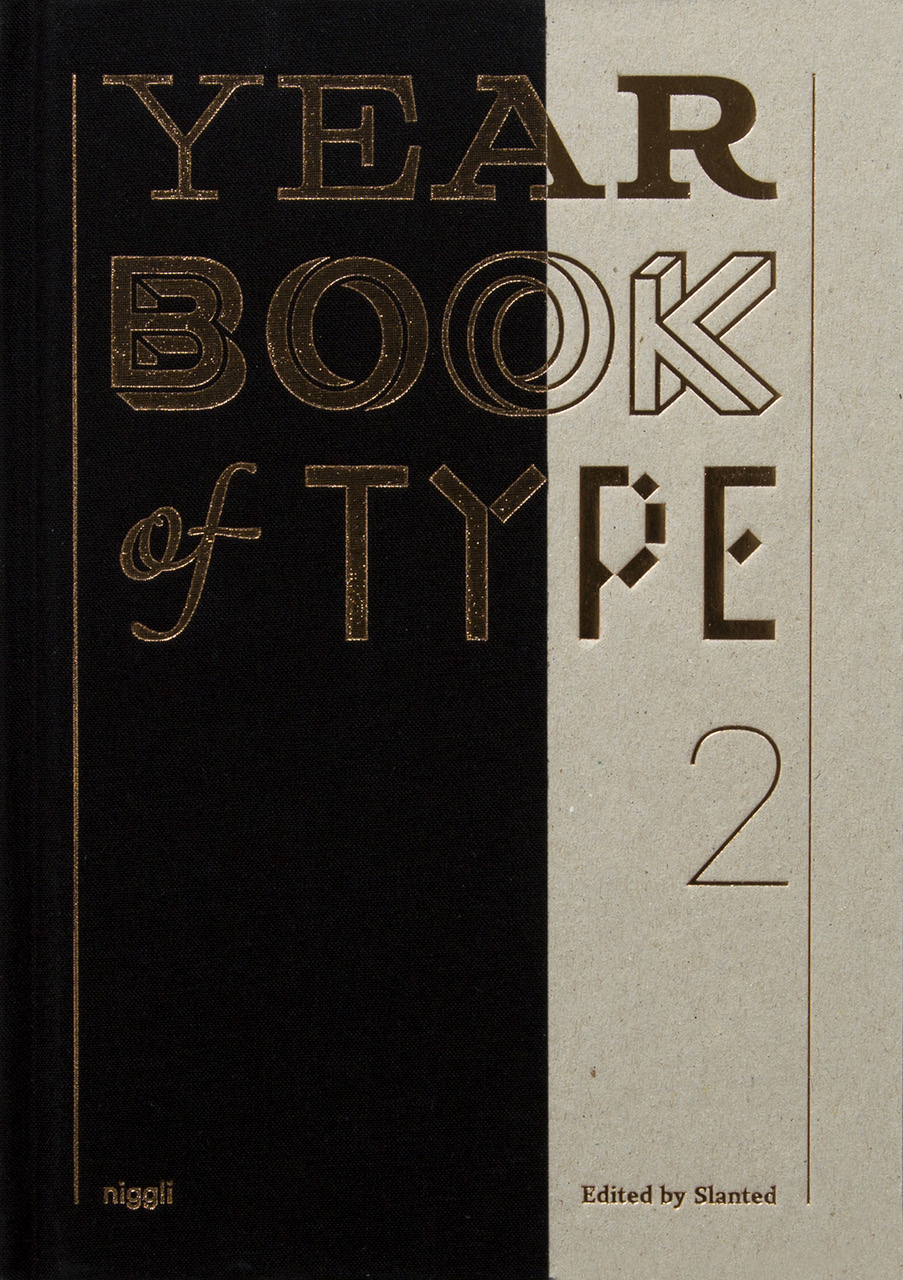 Yearbook of Type II
 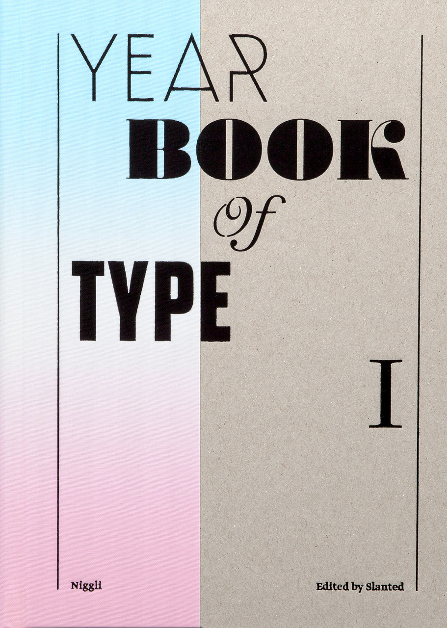 Yearbook of Type I